.jpg?ar=16%3A9&fit=crop&crop=top&auto=format&w=1440&q=80)
Once the sole preserve of pre-teen bedrooms and ‘50s kitsch, pastels have managed to pull off a major comeback in the last few years: done the right way, sorbet shades feel modern and fresh, not retro and twee.
Of course, this reinvention is in no small part thanks to one colour in particular. Whether you want to call it millennial pink or rose quartz, Instagram's favourite hue has proved just as irresistible in the interiors world as it has done for fashion designers and beauty brands (paging Glossier...). It's also acted as something of a gateway pastel: start off with pale pink and you might find yourself considering lilac (a washed out version of 2018's Pantone colour of the year, Ultra Violet), cornflower blue or even a soft lemon yellow or palest green.
We've scoured Pinterest for the most stylish and unusual ways to make the trend work in your home, from the unexpected colour combination that'll stop pinks feeling too 'Barbie' to clever ways to incorporate texture and pattern...
Pastel Living Rooms - Grazia
 1 of 13
pastel living room interiors inspiration
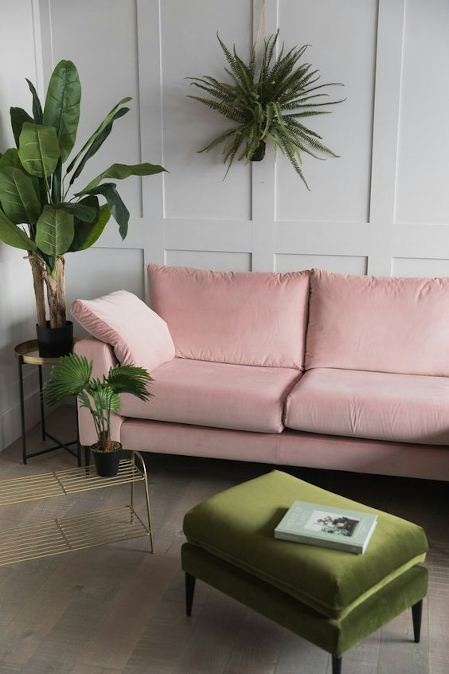
We're never sure exactly which colours the old adage refers to, but this set up proves that pink and green should definitely be seen together.
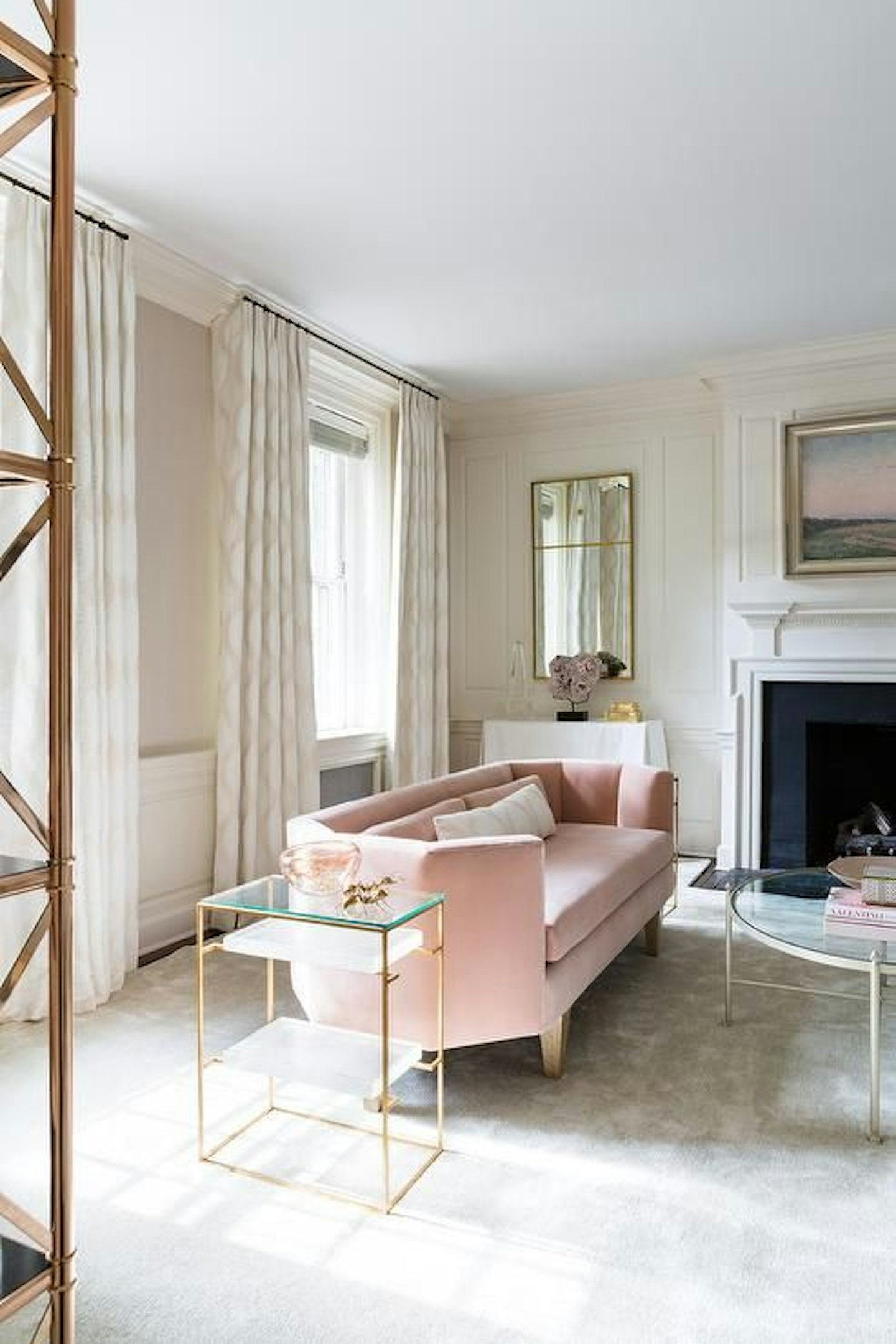
 2 of 13
pastel living room interiors inspiration
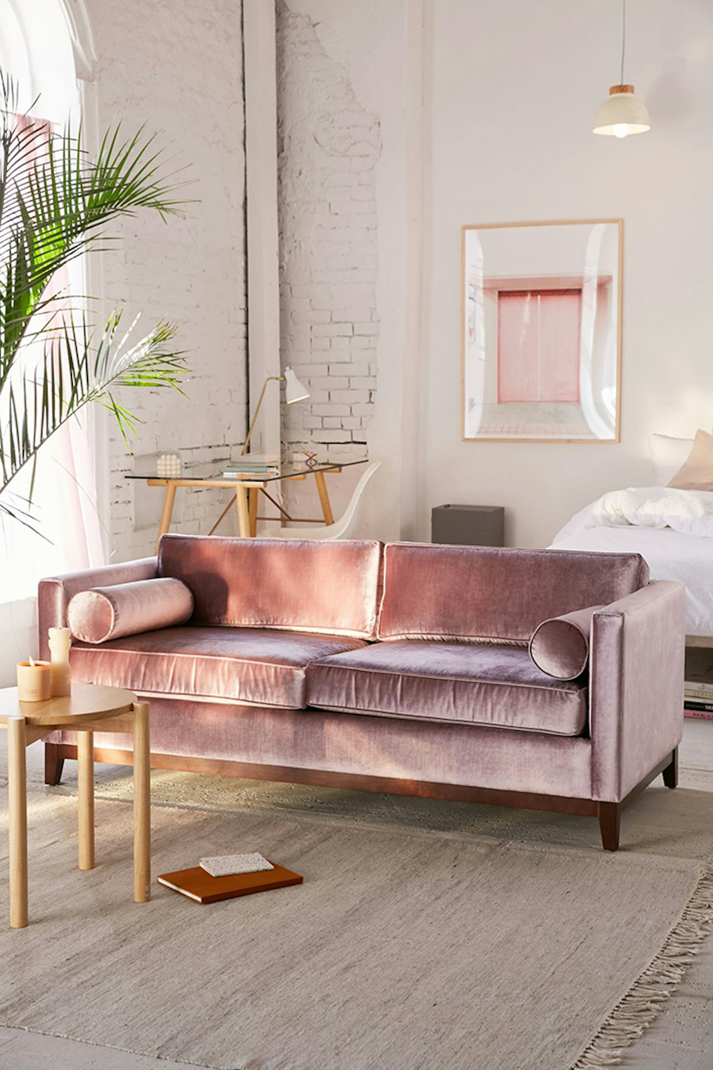
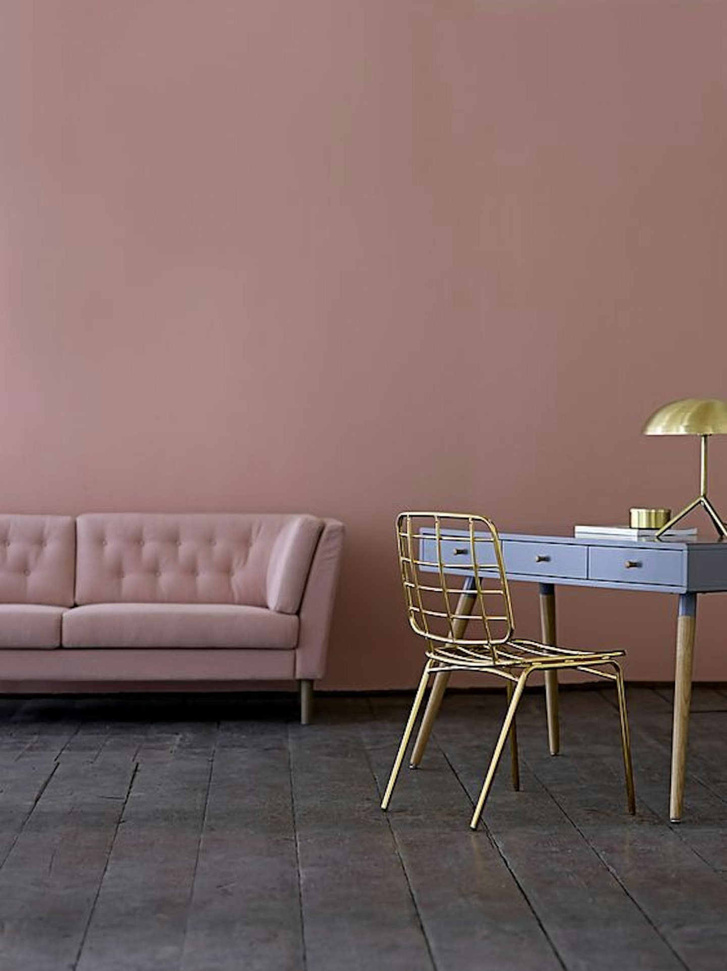
When did the pink velvet sofa become an interiors must have? We're not sure; we just know we need one ASAP.
 3 of 13
pastel living room interiors inspiration
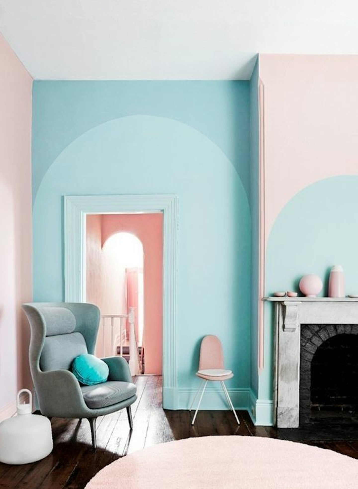
Pair two pastel shades together and the effect is unexpectedly maximalist (without leaving you with a headache).
 4 of 13
pastel living room interiors inspiration
Forget magnolia, a lick of pale blue paint can help smaller rooms feel light and airy (plus, here's proof that it makes a very Instagram friendly backdrop for botanicals)
 5 of 13
pastel living room interiors inspiration
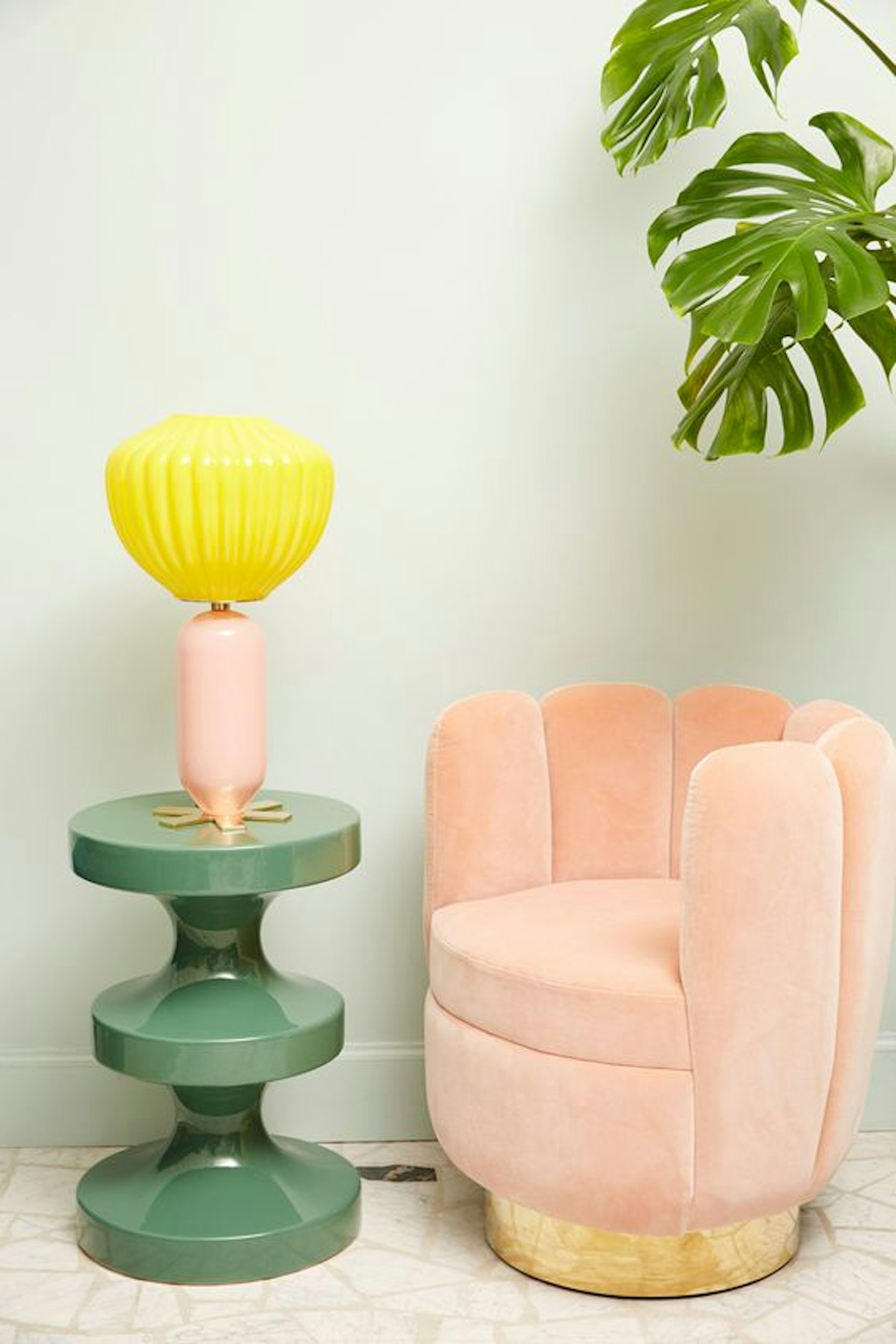
Time to add a pastel-hued scallop seat to the top of your interiors wishlist.
 6 of 13
pastel living room interiors inspiration
Shop around for accent accessories or prints in colours that subtly echo that of your statement piece of furniture.
 7 of 13
pastel living room interiors inspiration
This cornflower shade makes a striking backdrop for a gallery wall, with pastel blue accents popping up in the picture selection, too.
 8 of 13
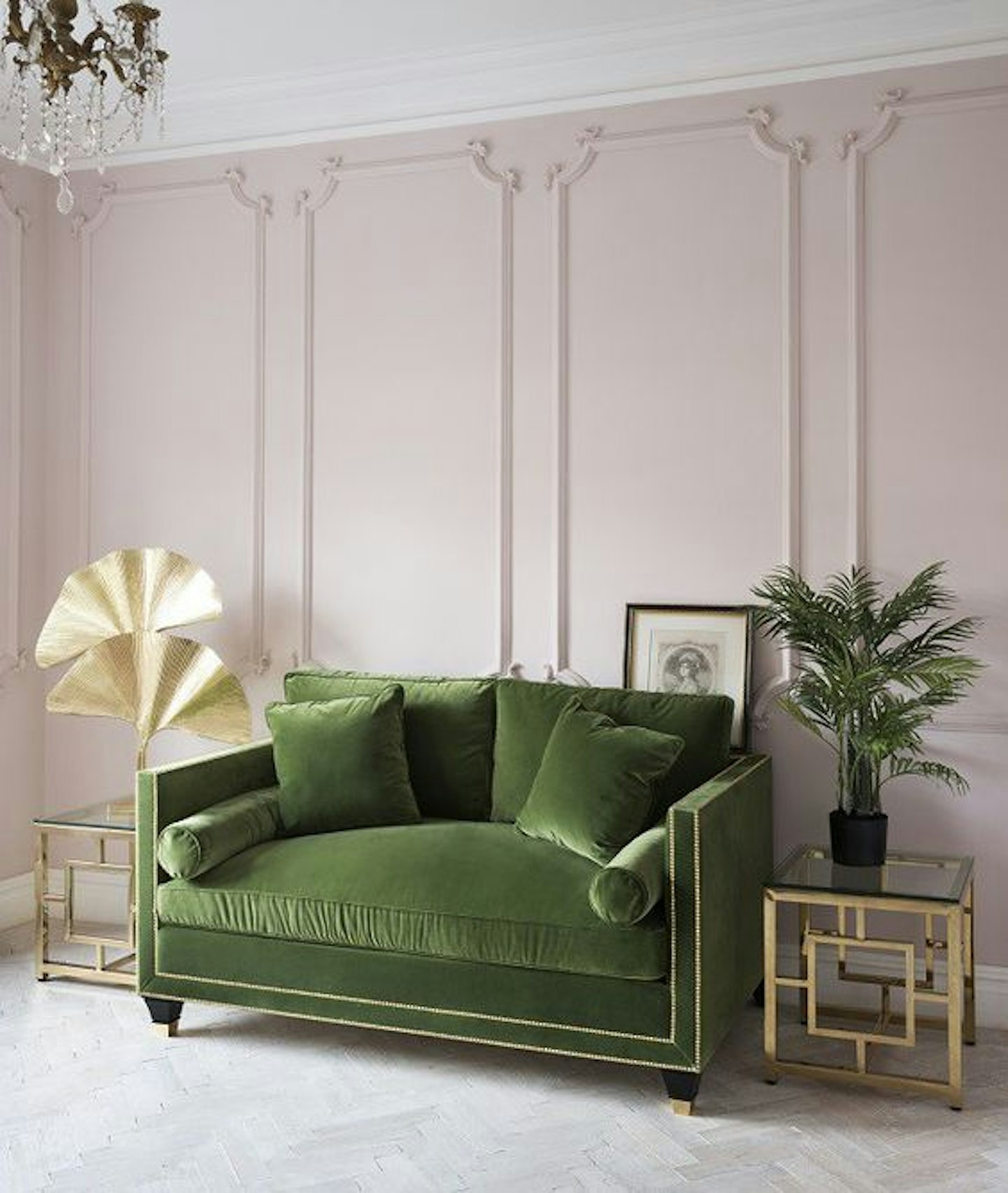
pastel living room interiors inspiration
Yet more proof that pink and green is the dreamiest of colour combinations. Here, a pale backdrop keeps the deep olive sofa from feeling too heavy or old fashioned.
 9 of 13
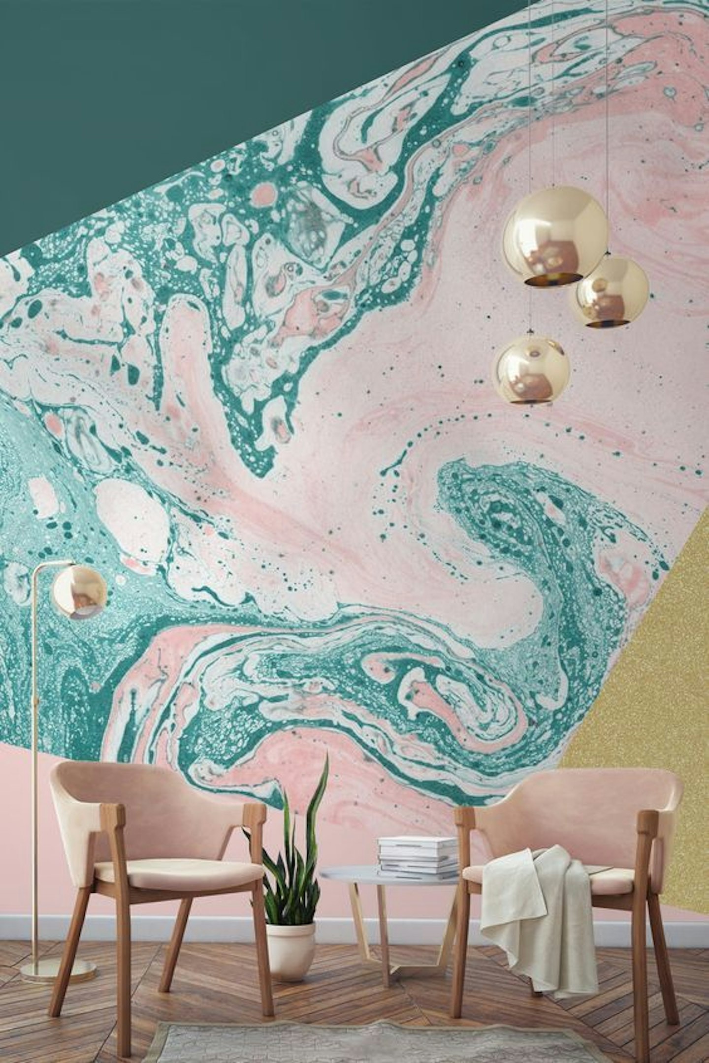
pastel living room interiors inspiration
Balance out a dramatic print (like this statement-making marbled wallpaper) with simple, clean lines for furniture and lighting.
 10 of 13
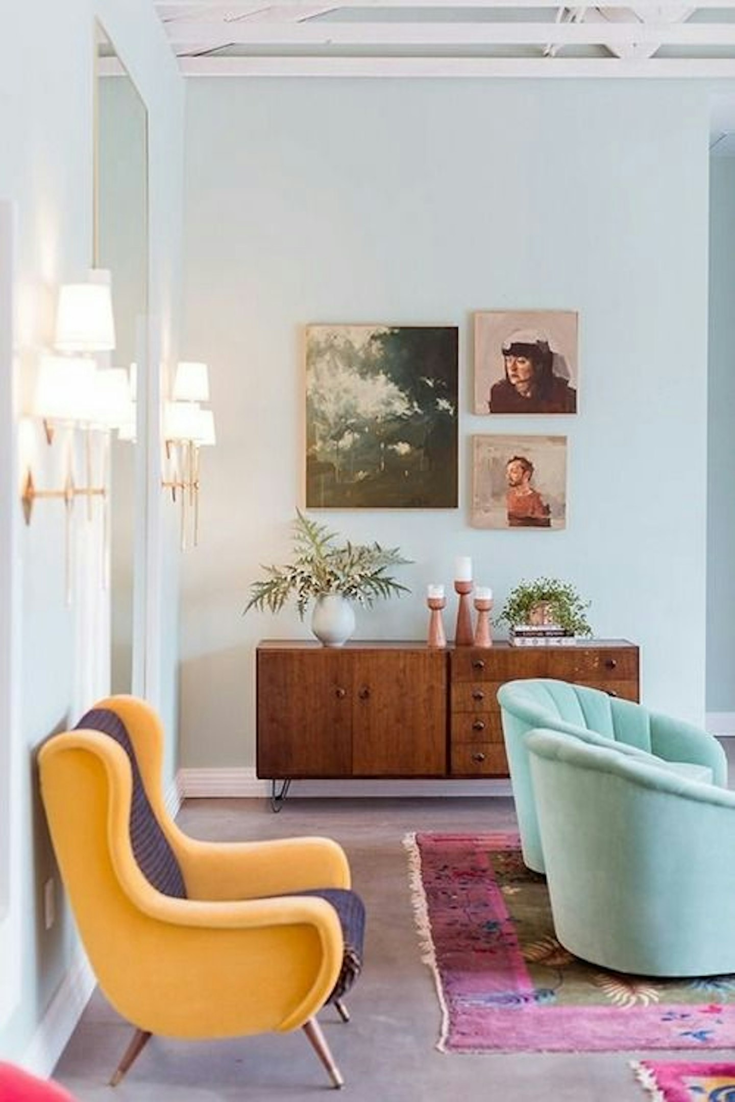
pastel living room interiors inspiration
As great as pastel on pastel looks, don't be afraid of pairing lighter shades with bolder pieces like this yellow chair.
 11 of 13
pastel living room interiors inspiration
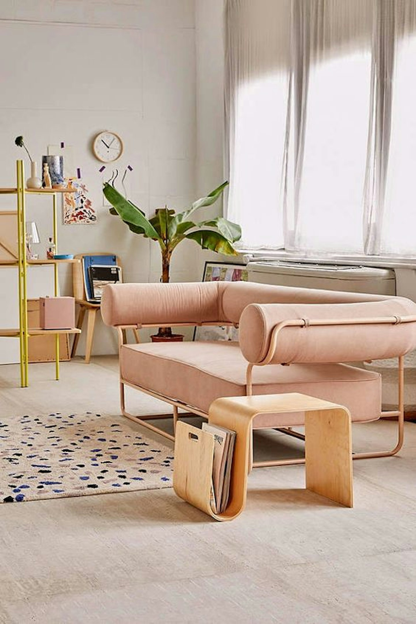
If a classic velvet sofa feels too traditional for your space, look out for pastel sofas in modern shapes like this one.
 12 of 13
pastel living room interiors inspiration
Metallic accents stand out against a millennial pink backdrop.
 13 of 13
pastel living room interiors inspiration
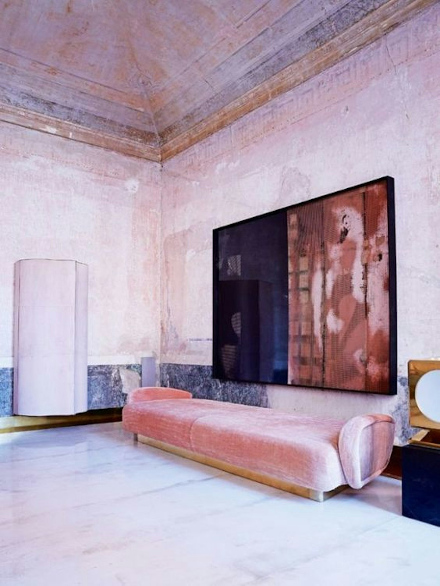
We can't all live in a pink palazzo, but we can dream__ of recreating these dappled walls...
And don't forget, pastels aren't just aesthetically pleasing and of the moment, either. With an unrivaled ability to make your space feel lighter, airier and more spacious, they're a particularly smart colour choice when it comes to decorating your living room.