Though the classic shelfie still holds undeniable clout on our social media feeds, recently there’s been a definite shift in the way we’re showcasing our interiors online. It’s as if our focus has zoomed outwards a little: stylishly arranged and usually featuring some variant of house plant, well put-together corners keep grabbing our attention. But are they as effortless as they appear on our Instagram feeds?
With this in mind, each week we’ll be asking one influencer to talk us through the most curated spot in their house. For our latest Story of a Corner, DJs, influencers and presenters The Collyer Twins have showed us how they put together the favourite corner in their London home...
The space
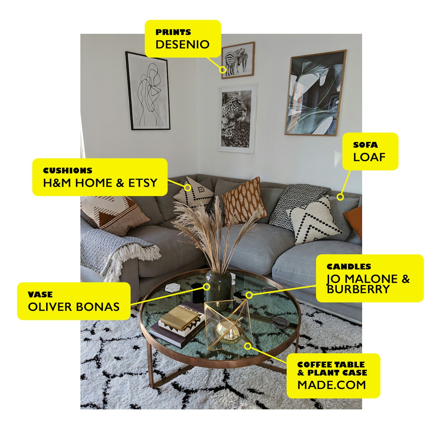
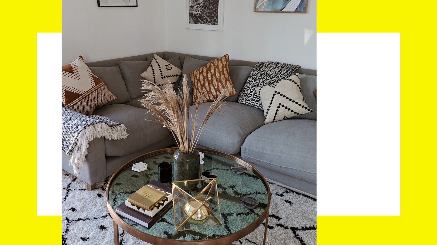
Our favourite corner of the room is in our living room. We've always loved the minimalist Scandinavian style and so wanted to add elements of this in to our home alongside an element of comfort. Most people comment on how cosy it looks, which is exactly what we went for. For us, it's our 'chill out zone' so we were adamant about having a super comfy sofa, (there's just something about corner sofas) embellished with some cute pillow cases and a rug too to give it that extra cosy factor!
Story of a corner, the collyer twins
 1 of 1
Story of a corner the collyer twins
The sofa
The sofa has to be one of the most important things in the living room space. It not only has to look stylish but most importantly has to be super comfortable as essentially it's probably the place you will be sitting (or laying in our case) the most! Our sofa is from Loaf. We went for a light blue/grey L-shaped style, to fit perfectly in to the corner of our room. We chose quite a neutral colour palette so it would be easier to add in pops of brighter colours with other furnishings such as the cushions and wall art.
The cushions are from H&M Home and Etsy. We love the asymmetrical patterns and I think the browns really compliment the black and whites. The two black and white throws are a little added extra from a shop on Columbia Road called A Portuguese Love Affair, which matches the colour theme.
The coffee table & candles
The circular brass coffee table is from Made.com. We love this table and think its such a nice addition to the front room and it's just the perfect size.
We're obsessed with scented candles, so on our table we have a beautiful Burberry one, a scented Myrh and Tonkah Jo Malone one and a gold vanilla bean one in a gold plant case from Made. They are perfect for a nice chilled evening to unwind and relax and set the mood! We've also filled one of our beautiful vase from Oliver Bonas with weeping willow stems - they go really well with the nature-themed prints behind. We actually picked these from the garden outside our apartment (shhhhhhh).
The rug is one of our favourites as well. Again, sticking to a rather neutral palette of black and white to fit the Scandi theme, we opted for a large asymmetrical patterned rug from Modern Rugs. Very affordable and super cute! Unfortunately our flat came with a very ugly, mouldy grey carpet, so buying a large rug was extremely necessary to cover as much of that as we could.
Art work
Now, what is a living room without lots of art work? Most of my prints are actually from Desenio, this is a super affordable online store that sells lots of prints and posters that match well if your going for a Scandinavian and Nordic interior. On one of the corners, we've gone for a more artsy print drawn by an illustrator named Peytill which is actually one of our favourites. And on the main wall we've opted for a more nature and animal based theme, reflecting our love for the outdoors and nature. I quite liked the contrast of vibes here and think its quite a good reflection of the two sides of personality. Arty and creative as well as nature-loving adventurer!
Jordan and Loanne, identical twin sisters from London are digital influencers, DJs and presenters - you can follow them on Instagram @collyertwins.
