Though the classic shelfie still holds undeniable clout on our social media feeds, recently there’s been a definite shift in the way we’re showcasing our interiors online. It’s as if our focus has zoomed outwards a little: stylishly arranged and usually featuring some variant of house plant, well put-together corners keep grabbing our attention. But are they as effortless as they appear on our Instagram feeds?
With this in mind, each week we’ll be asking one influencer to talk us through the most curated spot in their house. For our latest Story of a Corner, writer, photographer and stylist Abi Dare of These Four Walls has showed us how she put together her favourite nook in her Bristol home...
The space
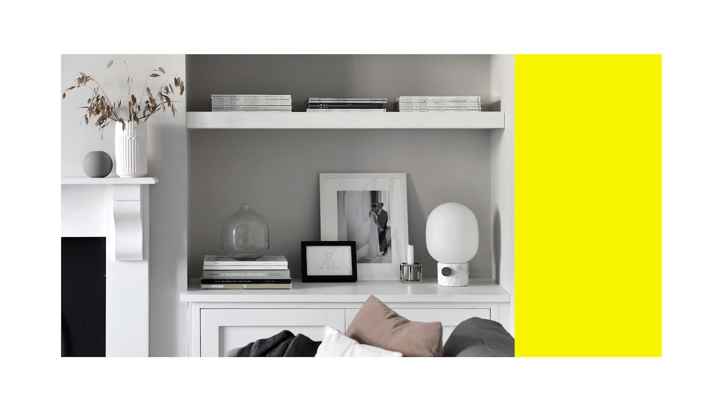
My favourite corner of my house is the living room - it's a calm, clutter-free little sanctuary where I can chill out at the end of the day. I work from home but never in this room, as I like to keep it for relaxation. I don't let myself bring my laptop in here, and as soon as I sit down on the sofa in the evening I can feel myself start to unwind.
The walls
The walls are painted in a soft grey from Farrow & Ball called 'Cornforth White', and there's a bit of an unusual reason behind it. I have a condition called synaesthesia, which is when one sense merges with another rather than being experienced separately. It can manifest itself in all sorts of different ways, but in my case it means I see each letter and number as a specific colour. As a result my mind is constantly buzzing with different shades, so I need my home to be a muted space decorated in neutrals – it's a bit of an antidote, I guess.
The accessories
I'm obsessed with Scandinavian design - it suits my minimalist style, and I love how timeless it is. Many of the most iconic pieces were created back in the Fifties and Sixties but they look just as stylish today. I have a few Scandi classics on display in this corner, including a 'Kubus' candleholder, first designed by Danish architect Mogens Lassen back in 1962. My favourites, though, are the two vases on the mantlepiece. The little grey one comes from Swedish brand Cooee Design and the founder Catrine sent it to me as a gift. The other is a contemporary twist on a classic vase by Lyngby Porcelain and was a present from a blogger friend in Denmark. Actually, I should probably say that my wedding photo is my favourite piece, but the vases definitely come a close second!

The books
Everyone always comments on the books on the shelves, because I've turned them all the wrong way round! I love having books in the house and could never part with my collection, but my synaesthesia means I can't cope with lots of brightly coloured spines on display. It's definitely a bit 'Marmite', and people either love it or hate it. My husband thinks it's ridiculous, but I really like it - and I know roughly where things are when I need to find them
Follow Abi on Instagram @thesefourwallsblog
