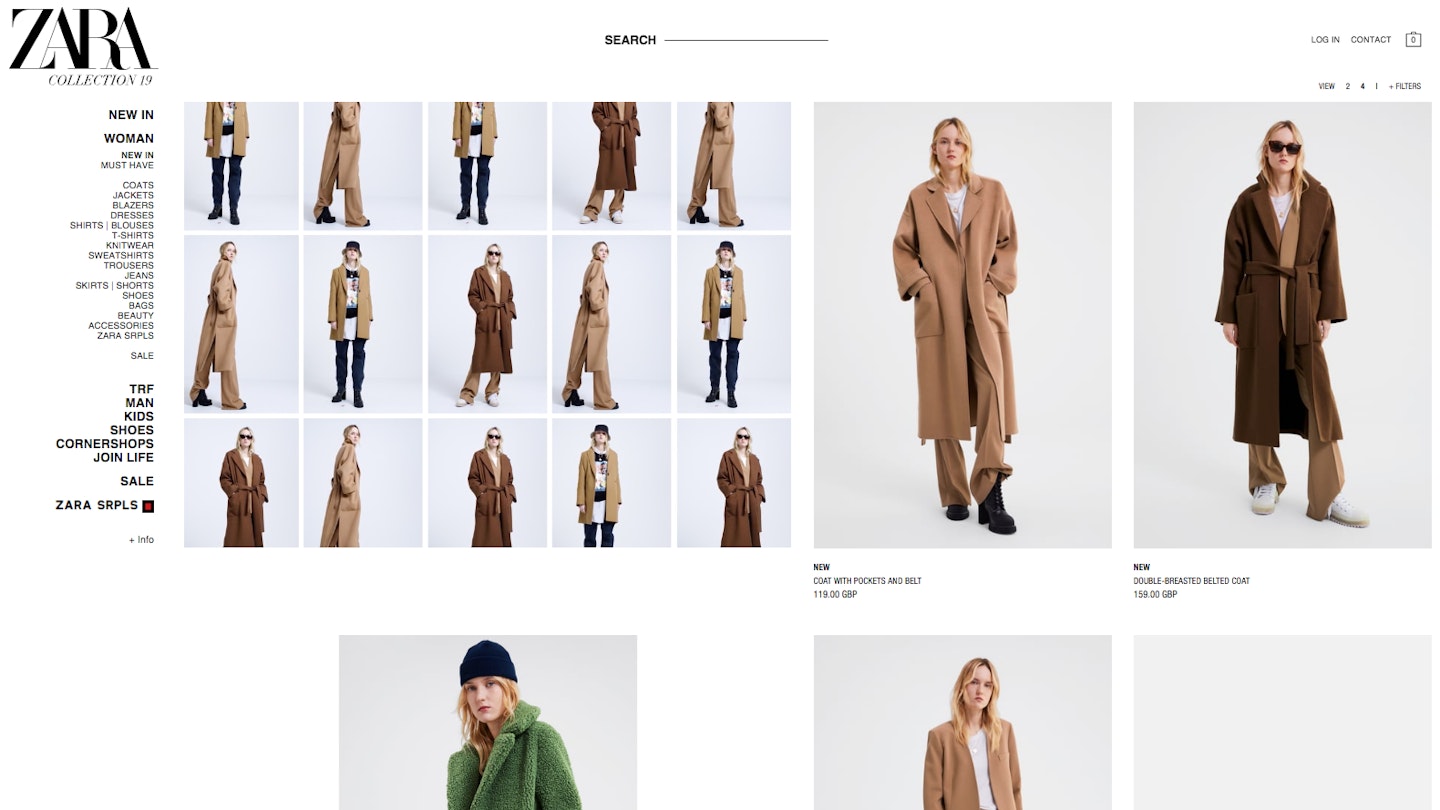
If you found yourself procrastinating on the Zara website yesterday (like we were) you might have noticed that there was something different about the experience. The retailer didn’t just surprise us with a new collection but a whole new logo.
Out went the sans-serif branding that has defined the brand since 2010 and in was ushered a new overlapping font. Advertising agency Baron & Baron redesigned the band’s insignia with more curvaceous lettering (similar to the Harpers Bazaar logo). It’s said that the agency’s artistic director and founder Fabien Baron is to thank for the new typography.
This is only the second time in the 45-year history of the Spanish high street shop to update its branding. Previously the logo was defined by generous spacing and graphic letters free from any ornamental curves. This new iteration retains the capitlisation of the name but squeezes the letters together and adds articulated curves to the edge of the 'R' and accentuated serif to the 'Z' and 'A's of the four letter name. It has already been seeded out on the website and social media.
Increasingly luxury labels from Burberry and Balenciaga to Saint Laurent and Rimowa are dropping their heavier serif logos for a starker, increasingly simplified branding. The redesigns are so similar and so spartan that this sea of change has been snarkily nicknamed ‘blanding’. However, the new logos make brand names easier to read and easier to transfer at scale onto all number of products and promotional material.
For Zara, the result of so many brands opting for a logo similar to their prior design ultimately makes their update standout more.
